Apercu Landing Page
UX/UI Designer
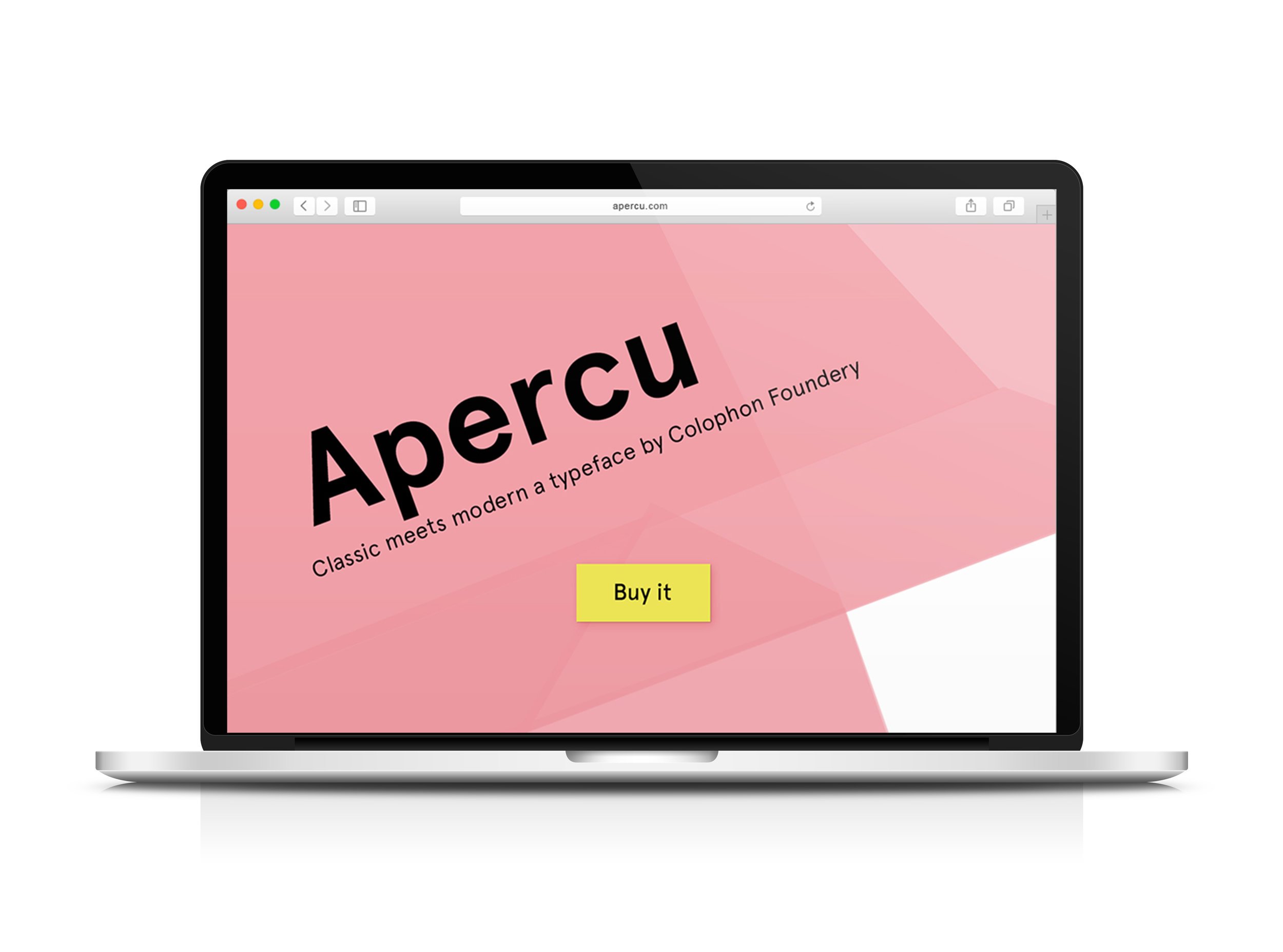
The Exercise
For this project I was enlisted to create a landing page for a typeface with a call to action button that has a single purpose, to sell the font/font family.
The challenge
Sell Apercu the typeface to users with a single CTA landing page.
Design Inception
When research Apercu it was describe as a modern take on four classic fonts. I used this as my launching point for my design inception. Apercu is a curved and rounded font that is open. In order to create visual interested I wanted to create contrast to do this the movement and shapes used needed to be angular and linear while creating a sense of depth and layering. Apercu is a modern typeface and the colours used in relation to it needed to be fresh and contemporary.
Mood Board
Mood board
Apercu is a widely used font however it’s most known uses are for modern and forward thinking brands or companies. I wanted the landing page to reflect this. I took my colour inspiration from split complimentary colours in the image on the far left of my mood board. The colours are Fresh and high contrast. Apercu is a rounded typeface because of this I wanted to create a visual contrast with angular shapes and linear movement. With these shapes I also wanted to create a sense of depth to add interest in order to accomplish this I took inspiration from Do-suh Ho’s Sculptures
Style tile
Branding
Apercu is a perfect example of a combination of typefaces to create a modern version of four classics. I wanted the branding of the landing page to represent this modernism.
Take Aways
Overall I feel my typeface landing page was successful through the use of mood, colour, shape, movement and space. Creating a landing page of this nature was not the easiest task to complete using photoshop, I think using a vector based program for the background layering effect would have been more effect and accurate. In the future I would explore this technique using a vector program.